SkipCast Development Log - A Look Behind The Curtain.
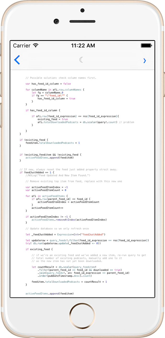


One of my favorite user experience interactions of Apple's official Podcast client is pull to refresh for new episodes. I love it so much it's the basic new episode transaction in SkipCast. There is something so pleasant about that action, not knowing if you will get a new episode but delighted when you do. It's a surprise every time, what's not to love?
I realize it's not for everyone though, so I plan on adding a background fetch mode to SkipCast. The fetch will work at app launch, and as a background activity. Care must be taken with the background method, as Apple's Watch Dog seeks out and kills processes if they run too long. Do this too many times and iOS will simply block your app from any background activity.
What method so you prefer? Drop me a line at info at skipcast dot net and let me know!
I can't believe it took 2 months for me to remember this step. First, check this out:
Here's run #1 : 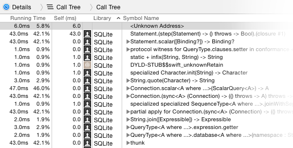
...and we'll call this Run #2: 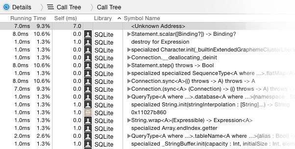
See that massive drop in CPU on Run 2? That's after adding a single index on an integer column in my SQLite database. The difference is even more pronounced on real hardware, where I'm seeing a half second or more shaved off some queries.
It's funny. In the move to iOS development I've focused so heavily on Swift performance and optimizations I've forgotten one of the most basic: If your app uses a database, for goodness sakes add indexes!
The earliest sketches for SkipCast centered almost exclusively on the player interface, as that's what I found most lacking in the competition. The goal was to provide a uniquely quick way to skip around episodes; the reason, selfish: I'm an avid biker and runner, and the last thing I want to do is crash into something when searching for a tiny pause or skip button.
After spending the first few weeks getting up to speed with AVPlayer, file system work, and my database layer, the player screen was the first major UI project I took on. Two major obstacles here were Apple's Auto Layout and the general design sense of iOS 7.
Auto Layout because for a new iOS developer you have no clue what the hecks going on. Impenetrable constraints, a fiddly interface, "content hugging priority": it simply doesn't end. As Paul Hegarty notes in his wonderful Stanford iOS series, you simply need to play around with Auto Layout until it clicks.
The other major sticking point, oddly enough, was buttons. When iOS 7 was released back in September of 2013, Apple made a bold design choice: traditional buttons were out. Not the concept of a button of course, just the look. Up until iOS 7 buttons had always had borders. Now they didn't. Can something even be called a button if it has no border?
To build a iOS app without Auto Layout would have been easier. The price would be SkipCast not working out of the box with the iPad's wonderful new split screen view feature. The decision to not fight Auto Layout, despite it fighting me on many occasions, was absolutely the right one. The move to iOS 9 was a breeze.
In contrast, the decision to ditch border-less buttons was also correct. The player interface needed to have large buttons, but I simply couldn't get iconography or border less, Windows Phone style blocks to work.
I love the current player interface, and believe it fulfills its original, stated goal of being easy and safe for clumsy types like me.
The first committed build of SkipCast was on February 21, 2015. While true to its original vision, SkipCast has gone through a rather dramatic and continuous transformation. It's been an incredible experience.
Looking back at that first build, what's interesting for me is I can unequivocally say it absolutely stunk to be so green. I've been a web and C++ developer for years, what a shock it is to go back to being a complete novice. You see, SkipCast was my introduction into iOS programming.
The good news is at just over 32k lines of Swift code I think I'm finally getting the hang of this thing. I can write long blocks of code without error, the core concepts of iOS development no longer elude me. But in-between these two extremes were loads of compromises, tough decisions, and long, long hours of work. I hope to cover some of these difficult choices in the months that follow.
Of course I still have loads of features I'd like to add. From Deep links to Force Touch I've got my work cut out for me. I want to share these experiences as well.
It's been a great journey so far, and I hope you'll join me to see what comes next!